
Computing Devices International Symbol

Cowbell :: Image – Harbor Freight
“I think it needs to be punched up,” Tim the studio principal said. He was commenting on one of my most resolved sketches. I had no idea what he meant. It was the early 1990’s and I’d never heard those words put together before. Apparently, it was a phrase people were starting to use, at least in the marketing world, because I can’t imagine a designer saying it unless they were joking. Comments by the head of any studio should be more specific, or if not, only spoken with someone who understands them. I’m not convinced he understood what he meant. I think it was a phrase he’d heard at a marketing conference somewhere and thought it sounded slick.
“Remind me of where you went to design school,“ he said. “I went to Montana State University.” “Oh, that’s right, but didn’t you also go somewhere else too, somewhere out east, or something?” “Yes.” My neck started to get warm. It’s an innocent question if you’re just a curious person, but he wasn’t just curious, he already knew, and it smelled like an agenda. It was pungent and I could see it on his face too. I’d already been vetted, plus, I noticed the corner of my resume poking out from under his folder which is why I just said ‘yes’. Everyone around the table had blank expressions, except for the head designer. He looked at me knowingly.
I’d been hired to work with the staff designers on two identity projects. The studio was composed of Tim the principal, the head designer, two junior designers, a full-time freelancer, an account executive, and a production manager. A local corporation was dividing into two separate companies with completely different functions, so they required two different identities — one needed a symbol and the other a logotype. It was an extremely fast turnaround and they needed more help to make it happen, so the full-time freelancer who was also a friend recommended me. I sent over my resume and a few days later attended an initial meeting. We were briefed on the companies and the scope of each project. It ended with the creation of two teams, one for each identity. I worked on the symbol along with a staff designer and we had a week to generate the first round of ideas. I rendered my sketches with a black Sharpie on sheets of 9” x 12” tracing paper. We were encouraged not to throw anything away, to just brainstorm and keep everything for discussion. The following week everyone gathered in the same conference room as before. We pinned up our work and identified our strongest solutions and had brief discussions about the options. Two to three options were selected from each of us to be refined for the following week.
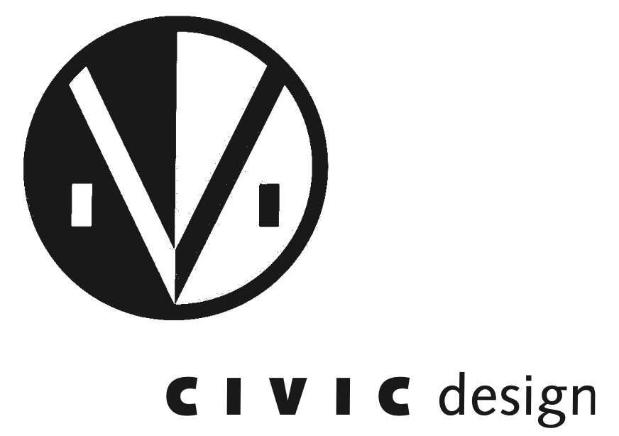
I worked on refining two symbols over the weekend. The following Monday the head designer called to check-in and confirm my approach to the revisions and talk about the schedule. After a minute, or two, he said, “of the two you’re refining, I think that one direction is the strongest and agree with your thinking on it, but Tim doesn’t understand what your mark means.” “Oh… OK, what questions does he have? Should I give him a call?” “No, I already went over it with him and said I thought it was the right direction. He still didn’t get it” To this day I don’t understand what he didn’t get. It literally incorporated the initials for the new corporate name and suggested a few appropriate tech references.
I arrived the following week with my refinements expecting the design staff to be gathered, but the meeting didn’t include everyone. It was just Tim the principal, the head designer I’d spoken with the previous Monday, and myself. I’m assuming the other designers had separate meetings too. Unfortunately, I didn’t get the opportunity see the symbol refinements that the staff designer had completed. After the meeting, the head designer said they would take one of my final roughs and tighten it up in-house. Once they did, he’d forwarded me their version to get my feedback. He called shortly after I received his email, thanked me for my work and asked me to send him my invoice. A few months later a cardboard mailer arrived from the studio and inside it was a spiral bound identity manual for the company symbol I’d worked on. I didn’t even know that my symbol had been chosen, but it was on the cover, used as a pattern on the inside front and inside back covers, and completely deconstructed throughout the manual outlining the usage parameters, including sizes, colors, its relationship to the brand typography, and various application options, from stationary to signage. I was in disbelief. Apparently, it didn’t need to be punched up, or need ‘more cowbell’.
— — — — — — —
More Cowbell Quote by Christopher Walken, SNL
— — — — — — —
For Paul S.
Songs :: It’s a Long Way to the Top (If You Wanna Rock ‘N’ Roll) by AC/DC, (Don’t Fear) The Reaper by Blue Öyster Cult, Lies by Manassas, and Respect Yourself by Joe Cocker
© C. Davidson